
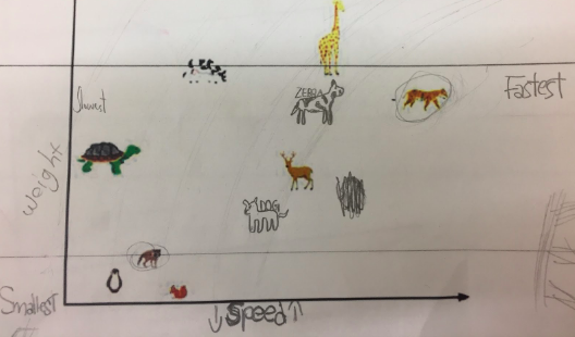
Take a look at the image on the left. What do you notice? You may recognize this image to be a graph. You may also know that this graph comes from a lesson written by inquiry mathematics advocate Jo Boaler. Boaler’s goal in her lesson, is for students to understand that graphs show comparisons. However, you’ll notice one difference between the image on the left and the image Boaler uses in her lesson plan. In this image, I have taken out the labels on the axis. My reasoning? Because I believed my students could figure that part out themselves.
I asked the following set of questions to my 4th grade classes.
- What can you tell me about this image?
- What would you label the axises?
- Where would you place a zebra? What about a dog?
Not only were my students able to correctly label the axises, but they also were able to infer where a dog and where a zebra would be appropriately placed on the graphs. Interestingly, each group had their own perspective as to where a “dog” and where a “zebra” would go providing opportunity for a unique classroom discussion on perspective. There can be different breeds of dogs, so why couldn’t this be placed differently!
Good inquiry mathematics stretches with the ideas of the children in the classroom. We took this one day exercise and turned it into a 3-day math project, as students wanted to create their own graphs similar to Jo Boaler’s animal one. My students researched topics such as flags of countries and weights of planets, and built their own graphs comparing and contrasting areas of interest. While starting off as just a math lesson, this project grew to incorporate geography, science, and social studies into math.
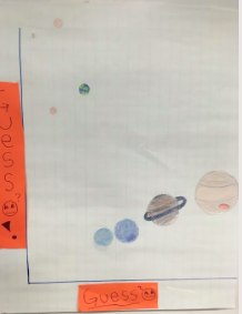
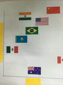
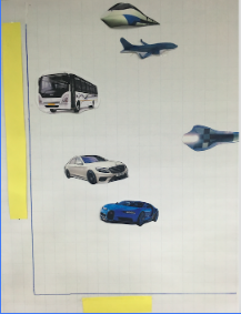
Some examples of my student’s final graphs. They wanted to leave the axis’s off to have other peers and community members guess what they were comparing on their graphs. Can you guess?
